Calling out design as one of our 5 Essential Elements of Excellence was an intentional decision. That decision was based on some instructional design trends that have emerged within the last three years.In the past, software or technology tools ruled the day in the development of content. It took special skills and a development team to make high quality materials. And while very high-end materials still require this, the field is now level. With the advent of Upwork, Elance, Freelancer and many others, anyone can now offer instructional design services, especially the development of eLearning materials. So what then becomes the differentiator? Creativity and design.
Here’s the thing…great content presented poorly will have a negative impact on performance. Worse yet, it makes a terrible first impression that can drive learners away. So here at Inno-Versity, we spend a lot of time thinking about design. In our minds, design includes thinking about tone and voice, character development (as needed), as well as the the typical choices of color, font and graphics.
As we considered the element of design, our team unanimously agreed that the three points listed below are key to our process. We spend a lot of time discussing them with our clients and then again as an instructional design team. Most aren’t original to us, but they are what we come back to over and over again when considering design.
3 Key Design Tips
1. Understand the role that colors and font play in learning. This seems obvious and has certainly been written about extensively. And, while you may understand this, how much time do you spend discussing design with your client? We often find that sharing these rules, and then educating our clients on their importance, is helpful. Often companies have a specific style guide they use for marketing that they wish to replicate in their learning materials. But sometimes these colors don’t work well when producing print materials or perhaps they might convey the wrong tone. Have this conversation with the client, show examples, communicate alternative ideas and voice concerns. Below we’ve shared just a couple articles that we have found to be the most helpful as a summary. Both are current and from well-respected sources in the learning community.
- The Color of eLearning
- Color Psychology of eLearning
2. Use images for a specific purpose. It is no longer good enough to just include graphics. They must illustrate the meaning. Ask yourself if they could stand alone on the page and convey meaning. If not, ask yourself if the picture somehow confuses the meaning. If you’re not sure, ask a friend, co-worker or another third party what they think when they see the graphics.
3. Use custom graphics. Let’s spend a little time here because this tip is one that we consistently get positive feedback on. While stock graphics have a place, almost all the work we do now is either custom or semi-custom. That doesn’t mean you need to have an in-house graphic designer or artistic help. The most basic of Microsoft Office© applications offer simple ways to customize graphics, as do many free online applications. Obviously, some standard graphic editing tools, such as Adobe Creative Suite©, are a little more sophisticated. But the basics can be learned fairly easily. Simple things, like adding consistency in colors across all graphics, using all photos or consistent framing, create a more custom look.
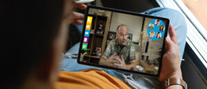
But the one thing we’ve found that has the largest impact is the use of on-site pictures captured with a client. Sometimes we take them ourselves. Sometimes the client takes them and we tweak them for consistency. Over and over we hear how learners love to see their work environment captured on screen or in print. We recently spent some time at a global location for a local client. As we were working with their teams, it occurred to us that we frequently struggle to include meaningful graphics in the materials we make for this site. The pictures not only add meaning, but create a real sense of engagement. The learners feel like the materials accurately represent their situation. Of everything we did on that trip, this was the most meaningful. The team was genuinely excited to be a part of this. Some even took their own pictures and sent them to us. Originally, our main goal was to improve the learning. But through this experience, we discovered taking custom pictures went a long way towards building a better relationship with our global client.
On location with a client.
So the next time you’re ready to start your next project, spend a little extra time thinking through these tips. You’ll be surprised how small design changes can improve the overall impact of the project.